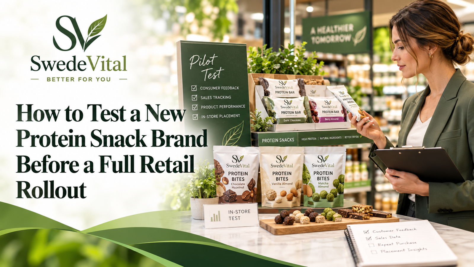
How to Create a High-Protein Snack Display That Gets Attention
Kort sammanfattat
A high-converting protein snack display groups products by shopper mission rather than brand, sits in a genuine high-traffic or queue zone, follows a tiered planogram with hero SKUs at eye level, and carries honest, benefit-led signage. Together these turn impulse traffic into incremental basket adds without discounting.
TL;DR
- Build a protein snack display around shopper missions, a high-traffic location, a tiered planogram, curated range and honest signage, then measure incrementality to prove it pays.
A high-converting protein snack display works because it makes one promise instantly legible to a shopper on the move: quick, better-for-you energy, right here. The displays that outperform group products by shopper occasion rather than by brand, sit in a genuine high-traffic or queue zone, follow a tiered planogram with hero SKUs at eye level, and carry honest, benefit-led signage. Get those four elements right and you turn impulse traffic into incremental basket adds without discounting your way to the sale.
This guide is written for the buyer's seat: category managers, store owners and distributors deciding how to earn a return on the shelf space a protein set consumes. It covers where to place the fixture, how to build the planogram, how to curate range without clutter, how to write claims that stay compliant, and how to measure whether the display actually pays.
Why a dedicated protein snack display earns its space
Demand for high protein foods is broad and durable. Shoppers now scan for protein content the way they once scanned for "low fat," and that behaviour spans gym-goers, busy commuters, parents packing lunchboxes and older shoppers protecting muscle mass. A scattered assortment, where protein bars sit in confectionery, protein chips sit in crisps and functional gummies sit near vitamins, forces the shopper to hunt. A dedicated set removes that friction and signals authority: this store takes better-for-you seriously.
A protein set also does commercial work that a standard snack aisle cannot. Protein products typically carry a higher price per unit and a stronger margin than mainstream salty snacks, and they attract shoppers who are less deal-driven and more benefit-driven. Concentrating them lets you trade the shopper up, cross-sell across formats, and build a destination that competitors without a clear protein story cannot match.
The trade-off to weigh
Dedicating a bay or a secondary sitting has an opportunity cost: that space could hold a proven high-velocity line. The honest test is incrementality. If the display mostly relocates sales you would have made anyway, it is decoration. If it captures new missions, trades shoppers up, or lifts units per transaction, it earns its footprint. Plan from the outset how you will tell the difference, which we cover under measurement below.
Start with the shopper mission, not the shelf
Before any fixture goes in, define who the display is for and what job it does for them. Most protein snack shoppers fall into a few recognisable missions, and the layout should map to them:
- On-the-go fuel: a commuter or gym-goer wanting a single-serve, portable option they can eat one-handed. They value speed, calories, and grams of protein at a glance.
- Everyday healthy snacks: a shopper replacing crisps or biscuits with something that feels like a smarter choice for themselves or their family. Taste and "clean" positioning matter as much as protein.
- Goal-driven nutrition: shoppers tracking macros who read the back of pack and buy in multiples. They reward range depth and clear specifications.
- Functional wellness: shoppers exploring adjacent benefits such as focus, recovery or sleep, who may cross into functional mushroom capsules, sprays or gummies, creatine, or magnesium.
You do not need a separate zone for every mission, but the planogram should let each shopper find their answer in seconds. When SwedeVital's own range is used as an example, the split is instructive: plant-based protein snacks such as protein lentil chips, protein bites, natural bites and protein bars serve the first three missions, while the functional-wellness line serves the fourth. Merchandising them in adjacency, rather than in one undifferentiated pile, is what makes the set readable.
Location: where a protein snack display actually converts
Placement decides most of the outcome. The strongest positions share one trait: they intercept a shopper who is already moving with intent or waiting with idle attention.
- Decompression and entrance zones catch fresh attention but can be walked past quickly; use bold, single-message signage here.
- Queue and till zones are prime for single-serve impulse formats, because a waiting shopper has time to reconsider a healthier grab.
- End caps on the main path give a protein set visibility without surrendering the core aisle, and they are ideal for a themed or seasonal push.
- In-aisle adjacency to sports nutrition, chilled drinks or the "free-from" set groups the mission together and supports considered purchases.
Avoid dead ends, low-traffic bottom corners, and positions where afternoon sun or heat can degrade product. A display near heat sources risks bloom on anything with a coating and shortens shelf life on the rest. If the only available spot is compromised, fix the environment before you fill the fixture.
Build the planogram in tiers
Once located, the display converts through structure. Think in tiers rather than in a flat wall of packs, because the eye reads vertically and the best real estate is finite.
The vertical hierarchy
- Eye level is buy level. Place your hero SKUs, the products with the best combination of margin, taste reputation and repeat rate, at roughly 120 to 160 cm. This is where you win the impulse decision.
- Waist to eye level holds your core range and secondary formats. It is easy to reach and scan, ideal for the bulk of everyday healthy snacks.
- The top shelf carries signage, a hero pack facing, or premium and gifting formats that benefit from being seen before they are reached.
- The bottom shelf suits bulk, multipacks and value formats, where shoppers expect to bend for a lower price per unit.
Block by benefit, then by format
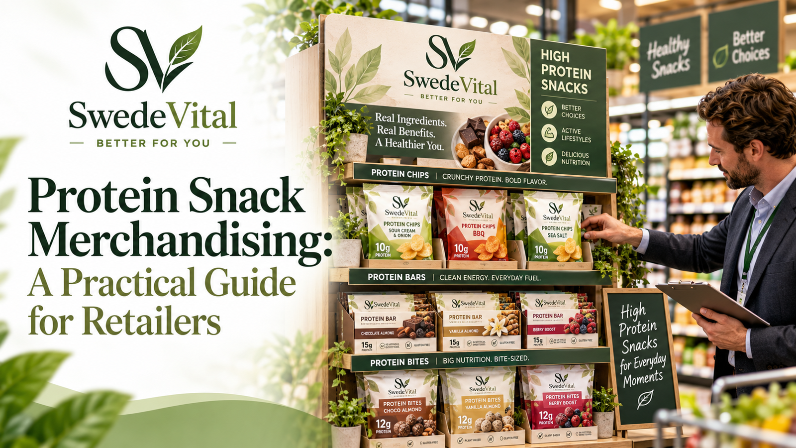
Within the fixture, create vertical blocks of like-with-like so the shopper's eye can travel down a "ribbon" of one benefit or format. A vertical block of protein bars, another of protein chips, another of bites, reads far more clearly than a horizontal mix. Colour-block by brand or sub-range within each ribbon to add order. Keep two to three clean facings per hero SKU so the display looks intentional and stays shoppable as stock depletes.
A protein set should be legible from three metres and shoppable from thirty centimetres. If a passing shopper cannot name the category in one glance, the signage is doing too little; if they cannot find their format in one reach, the planogram is doing too much.
Curate the range: breadth without clutter
The most common merchandising mistake is over-ranging. A wall of near-identical bars paralyses the shopper and starves your best sellers of facings. Curate deliberately across three axes:
- Format variety: cover the main eating occasions, for example a crunchy savoury option such as protein chips, a bar, and a bite-sized format, rather than five versions of the same thing.
- Dietary breadth: stock at least one credible plant-based and one broadly acceptable option so you do not exclude a growing segment. Plant-based protein snacks increasingly serve mainstream shoppers, not just vegans.
- Price ladder: offer an entry price, a core price and a premium tier so shoppers can self-select without you leading with discount.
Review the tail ruthlessly. If a SKU is not earning its facing on rate of sale or on a clear strategic role, it is renting space your heroes could use. A tighter, well-signed range almost always outsells a sprawling one, and it makes the whole set easier to keep in stock and looking full.
Where functional wellness fits
Functional formats such as Lion's Mane, Reishi, Cordyceps and Turkey Tail mushroom capsules, dual-extract sprays and gummies, plus creatine and magnesium sleep gummies, appeal to an overlapping but distinct shopper. Site them adjacent to the snack set rather than inside it, so the everyday snacker is not confused and the wellness shopper still discovers them. A small, clearly signed "functional" shelf can lift basket value without diluting the core message.
Signage and claims that build trust and stay compliant
Signage is where authority is won or lost. Shoppers deciding between high protein foods are reading fast, so lead with the single benefit that matters and let the pack carry the detail.
- Lead with the category, not the brand. A header that simply says "Protein Snacks" or "Better-For-You" orients the shopper before any brand competes for attention.
- Use benefit-led shelf talkers that are specific but honest, for example "a source of protein" or "plant-based," and keep quantitative claims aligned to what is on the pack and permitted in your market.
- Stay within the rules. Nutrition and health claims are regulated. Only use claims that are authorised and substantiated, and phrase any wellness benefit carefully. Where research is emerging, language such as "may support" is appropriate; avoid promising guaranteed outcomes.
- Make navigation obvious with small format or dietary tags such as "plant-based," "no added sugar" where accurate, or "on the go," so shoppers self-sort.
Honest signage is not only compliant, it is commercially smarter. Over-claiming erodes the trust that makes a shopper come back, and a returning shopper is worth far more than a single mislabelled sale.
A quick-build checklist
Use this as a build and audit list for any protein set, whether a permanent bay or a temporary feature:
- Confirm the location intercepts a real mission: entrance, queue, main-path end cap, or relevant adjacency.
- Check the environment: no heat, damp or direct sun that would degrade product.
- Define the missions the set serves and map blocks to them.
- Place hero SKUs at eye level; value and multipacks low; signage and premium high.
- Build vertical benefit and format ribbons, colour-blocked within each.
- Hold two to three clean facings per hero SKU and keep the set full.
- Curate a price ladder and at least one plant-based option; cut the dead tail.
- Lead signage with the category and one honest benefit; verify every claim is permitted.
- Site functional wellness adjacent, clearly signed, not mixed into snacks.
- Set a review date and the metrics you will judge it on.
Measure, then iterate
A display is a hypothesis until the data answers back. Decide before launch how you will judge it, then hold the set steady long enough to read a real signal rather than launch noise.
- Rate of sale per facing tells you which SKUs earn their space and which to cut.
- Category incrementality compares total protein-snack sales before and after, ideally against a control store, to prove you added sales rather than moved them.
- Units per transaction and attachment show whether the display is driving trade-up and cross-sell into adjacent formats.
- Waste and availability flag whether the range depth is right; frequent out-of-stocks on heroes or slow movement on the tail both point to re-ranging.
Iterate on a regular cadence. Promote proven performers to more facings, retire the tail, and rotate a feature or seasonal theme to keep the set fresh for repeat visitors. A protein snack display is not a set-and-forget fixture; it is a living part of the range that rewards steady attention with steady growth.
Vanliga frågor
Where should a protein snack display be placed in a store?
Position it where a shopper is already moving with intent or waiting with idle attention: entrance and decompression zones, till and queue areas for single-serve impulse formats, main-path end caps, or in-aisle adjacency to sports nutrition and free-from. Avoid dead ends, low-traffic corners, and any spot exposed to heat or direct sun that could degrade product.
What products should I stock on a protein snack display?
Curate for variety without clutter: cover the main eating occasions with different formats, such as a crunchy savoury option like protein chips, a bar, and a bite-sized snack, rather than many near-identical versions of one thing. Include at least one credible plant-based option and build a clear entry, core and premium price ladder so shoppers self-select instead of you leading with discount.
How do I display protein bars so they sell?
Block protein bars vertically as a single readable ribbon rather than scattering them, place your best-selling and best-margin bars at eye level, and keep two to three clean facings each so the set looks intentional. Group value multipacks lower where shoppers expect to bend for a better price per unit, and use an honest, benefit-led shelf talker above the block.
What signage works best for high protein foods?
Lead with the category, not the brand, using a clear header such as Protein Snacks so shoppers orient before any brand competes. Add benefit-led shelf talkers that are specific but honest and aligned to the pack, and small dietary or occasion tags for navigation. Only use nutrition and health claims that are authorised and substantiated in your market, and phrase emerging wellness benefits carefully.
How many SKUs should a protein snack display carry?
There is no single number, but over-ranging is the more common mistake. Enough SKUs to cover the key missions and formats, with a working price ladder, usually outperforms a wall of near-identical products. Review the tail on rate of sale per facing and cut any SKU that is not earning its space or serving a clear strategic role.
How do I know if a protein snack display is working?
Decide the metrics before launch and hold the set steady long enough to read a real signal. Track rate of sale per facing to judge individual SKUs, category incrementality against a control store to prove you added rather than moved sales, units per transaction for trade-up and cross-sell, and waste plus availability to confirm the range depth is right.